In late 2014, Govt.nz took on three designers from Massey University’s Open Lab program to research the design of our site and offer potential solutions.
Read our blog post about the design overhaul for more about this unique partnership.
Part of the final design solution was to structurally simplify www.govt.nz taking out some levels in the navigation to allow people to find information more simply and quickly.
The content team was aware from feedback that users found the current structure of the site confusing because:
- it didn’t tell them if there was more information ‘below’ the level they were on
- it didn’t signify what sort of information they could expect to find
- navigating through the site could be tricky.
We knew that some of our content was in the wrong place. The site is currently split into 17 ‘hubs’ — these are the main content groups you see when you come to the homepage. Feedback and experience had told us some of these groupings didn’t always make sense for our users.
Finally, during the beta (or test) phase of Govt.nz some content was written that wasn't fit for purpose. Often, draft content had also been placed into the information architecture (IA) of the site and never finished or published.
This meant the site was cluttered on both the frontend and the backend, and suboptimal to navigate and manage for users (ie readers) and the content team.

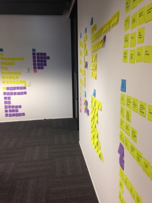
We covered lots of walls like these during the site restructure planning.
The audit
With all this in mind, the content team undertook a detailed audit in January. The audit covered well over 400 items on the site. The ‘Government A-Z’ directory was out of scope, but we’re conducting separate research around it.
We decided what should be tweaked or rewritten, left as-is or retired from the site. It allowed us to design a new IA for the site – to regroup content so that it would be easier for our users to find.
But while experience told us our proposed IA was an improvement, we needed to test it, too.
The testing
My colleague Gail Connelly is going to go into a lot more detail about this in another blog post soon. In short, though…
We ran two different types of tests – a card sort and an A/B tree test. We designed the former to see how users would group content chosen by us, so we could check our new hub groupings.
The second allowed us to test the ‘old’ vs the ‘new’ IA, to ensure that the new one was better.
It was.
The content models
During the same period, we sat down and thought about the templates we use for different types of content and how they relate — these are the Govt.nz content types and models.
We ended up retiring a number of content types and introducing some new ones: single- or multiple-page info or process content. These will give us another way to clearly signal to users what they need to know and do. They'll also allow us to start measuring what sort of content people find most helpful.
The restructure
We brought all this together last week. We converted all our content into the new content types, got rid of what we didn't want and re-ordered the remainder into our new IA. Plus a bunch of other cleanup, of course.
If you're wondering why you can't see any changes right now — they'll drop in place next Monday afternoon, when the new structure goes live.
The conclusion
And so, here we are: 15 hubs, 354 pieces of content and, we hope, a far easier journey for our users.
One of the biggest changes you’ll see is our Citizenship and immigration and Passports, travel and tourism hubs are no longer there. We retired them. Instead, there are now far clearer groupings: Coming to NZ, Leaving NZ, and Passports and citizenship.
Stay tuned, though! We’re working on something which will give users another way to navigate the site intuitively.
Of course, we’ll keep testing, listening to feedback and improving the site.

