Over the last few months I have been working with Nathan Wall finding out how agencies manage their web analytics reporting and what their needs are. We’ve now created some easy to understand dashboard reports. It’s a solution that:
- can be automated
- will help agencies with routine web analytics reporting
- will encourage consistent and common reporting across government
- will reduce the feeling some people have of being overwhelmed by data.
Creating easier to understand dashboard reports
Dashboards! Everything and everyone needs a dashboard! But what should dashboards show on them? How do we provide content owners with easy to understand information about what’s happening on their sites so they can use that information to make informed decisions and prioritise improvements.
After speaking to a number of agencies we identified 3 basic types of dashboard needed:
- "traffic" dashboards
- "engagement" dashboards
- "experience" dashboards.
We’ve built examples of each of the 3 dashboard types to find out:
- if the concept of common web analytics reporting will be useful to agencies
- if there is a common approach to web analytics reporting we can use across different websites
- what’s needed to automate the collection of data to build the dashboards
- if there is an opportunity for public release of web analytics data.
A common approach to reporting
We think it’s possible to use a common approach to report basic analytics about our websites.
For the proof of concept, we created dashboards for 11 different websites across government. All websites have a purpose: some require the user to complete a task; others require the user to find information. No matter what the purpose, we found all the dashboards we built could have a common layout.
"Traffic" dashboards
Detailed description of Figure 1
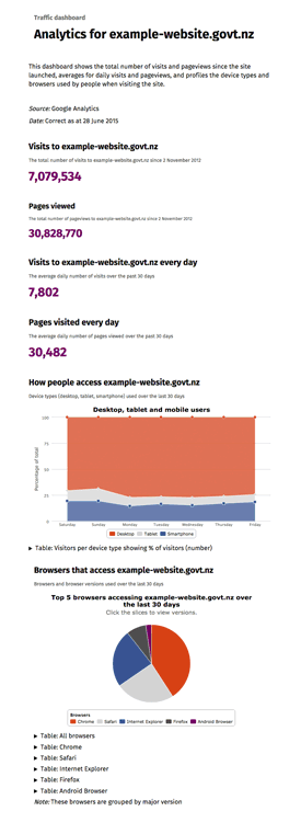
Analytics traffic dashboard
The traffic dashboard shows the total number of visits and pageviews since the site in question launched, gives averages for daily visits and pageviews and profiles the device types and browsers used by people when visiting the site. The data on the dashboard is correct up to yesterday. Each traffic dashboard gives the following information:
Visits to the example website.govt.nz
Shows the total number of visits to the site since a date specified by the site owner. In this example, the number shown is 7,079,534.Pages viewed
Shows the total number of pageviews since the date specified by the site owner. In this example, the number shown is 30,828,770.Visits to the site every day
Shows the average daily number of visits to the site in the past 30 days. In this example, the number shown is 7,802.Pages visited every day
Shows the average daily number of pages viewed in the last 30 days. In this example, the number shown is 30,482.How people access the website
Users access the website using desktop, tablet or mobile devices. The dashboard will show, using a line graph, the number of users accessing the site using what device over the last 30 days by days of the week. This example shows a slight increase in mobile device use over the weekend.The data supporting every graph on every dashboard will be accessible as well.
Browsers that access the website
You can find out which are the top 5 browsers accessing the website over the last 30 days, and can click down into each browser type to find the version of that browser being used. In the example shown Chrome, Safari and Internet Explorer are the most commonly used browsers.
Traffic dashboards provide basic stats such as:
- pageviews for the entire site
- the total number of visits to the site
- top 10 pages visited
- the top country of origin where visitors came from
- the types of browsers and devices visitors to the site are using.
Sound familiar? Well it should. A lot of agencies report on these high-level stats in their monthly and quarterly reports. We think we can make that reporting a bit easier, giving people more time to look a little deeper into what the data reveals.
"Engagement" dashboards
Detailed description of Figure 2
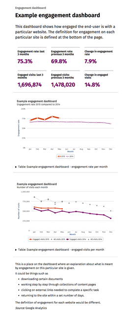
Example engagement dashboard
Engagement dashboards show what proportion of users are interacting with a particular website. The definition for engagement differs for each website.
The dashboard shows the engagement rate:
- over the last 3 months (in this example, 75.3%)
- over the 3 months prior (in this example, 69.8%)
- the resulting change (in this example, 7.9%).
It also shows the number of engaged visits:
- in the last 3 months (in this example, 1,696,874)
- in the three months prior to those (in this example, 1,478,020)
- the resulting change in the number of engagement visits, expressed as a percentage (in this example, 14.8%).
The dashboard shows two graphs:
- The first shows the overall engagement percentage, plotted over the months of the year, comparing year on year. In this example the graph shows engagement increasing slightly in 2015 to 75%.
- The second shows the number of engaged visits and the number of overall visits to the site plotted over months comparing year on year. In this example the number of engaged visits is fewer than the number of overall visits to the site, and over time the numbers decline.
- The data supporting both graphs is accessible as well if the user would like to view that information.
Engagement dashboards and what they report on varies from site to site, however the way in which the engagement is presented on a dashboard can be consistent. We’ve measured engagement by looking at key user journeys and measuring the proportion of users that did tasks on a site, such as:
- downloading certain documents
- working step-by-step through collections of content pages
- clicking on external links needed to complete a specific task
- returning to the site within a set number of days.
Working out what to report on means site managers and content owners need to be clear about what success means for their site. Not such a bad thing if you ask me!
Is “engagement” the “right” word to use for these reports? Well to be honest we’re not completely sure, but haven’t been able to come up with something else. If you can think of a word that says “Did your users actually do what you wanted them to do?” in a simpler way, let us know.
“Experience” dashboards

Detailed description of Figure 3
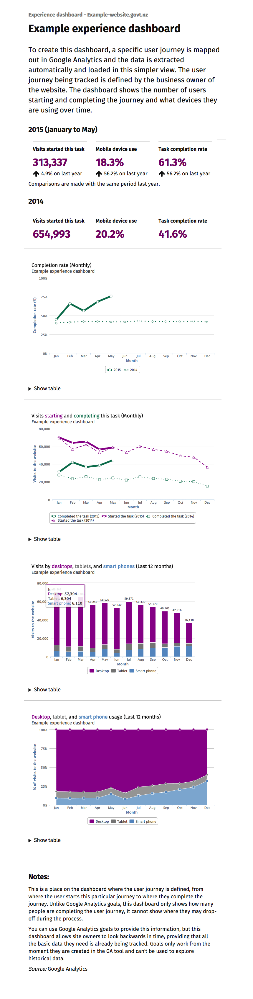
Example experience dashboard
The experience dashboard is created by mapping out a specific user journey in Google Analytics. The data will automatically be extracted from Google Analytics and loaded into the dashboard. The user journey is defined by the business owner of the website. The dashboard shows the number of users starting and completing the journey and what devices they are using over time.
In this example for year to date in 2015, 313,337 visits started the task (4.9% up on the same period last year), 18.3% used a mobile device (up 56.2% on the same period last year) and the task completion rate is 61.3% (56.2% on the same period last year). In 2014 the number of visits starting this task is 654,993, mobile device use is 20.2% and task completion rate is 41.6%.
The completion rate
The completion rate is plotted on a line graph, showing comparison between 2014 and 2015. In this example the completion rate is increasing in 2015.
Visits starting and completing this task
The number of monthly visits starting and completing this task in 2014 and 2015 is plotted on the next line graph. In this example the number of visits in 2014 starting and completing the task remained consistent, but declined over time. In 2015 the number of visits starting the task remained consistent with the prior year figures, but the number of visits completing the task increased.
Visits by desktops, tablets and smart phones
The number of visits over the past 12 months per device is plotted on a column chart. In this example, the volume of visits using a desktop is far greater than The number of tablet and smart phone visits. however, smart phone visit numbers is gradually increasing.
Desktop, tablet and smart phone usage
This area line chart shows the percentage of desktop, tablet and smart phone usage is plotted over the last 12 months. In this example, the percentage of smart phone usage is increasing by approximately 20% over the past 6 months, with tablet usage remaining constant and desktop usage declining.
Notes
At the bottom of the dashboard there is a place where the user journey is defined, from where the user starts this particular journey to where they complete the journey. Unlike Google Analytics goals, this dashboard only shows how many people are completing the user journey, it cannot show where they may drop off during the process.
You can use Google Analytics goals to provide this information, but this dashboard allows site owners to look backwards in time, providing that all the basic data they need is already being tracked. Goals only work from the moment they are created in the GA tool and can't be used to explore historical data.
We think “Experience” dashboards are where the real value starts to be shown. Using a feature in Google Analytics called segments, we map out specific user journeys and then measure the completion rate – meaning, how many users got to the end of the user journey.
This technique doesn’t confirm things like users were able to find what they were looking for, or that they understood they were reading, but it’s an indicator at least in broad-terms that the site was meeting at least some of their needs.
In addition to an overall completion rate, we can segment users by things like the type of device they used, and see if that had any impact on their ability to complete the task or journey.
Automating the dashboards
We’ve built the proof of concept dashboard interface using the Common Web Platform (CWP). If the dashboards are turned into a live service, this does not mean your website needs to be on CWP to take advantage of the easier reporting. You just need to have Google Analytics running over your site and you’d need to give the dashboard tool we’ve built access to your analytics data. We’ll use Google’s API to pull in the data to the dashboard, so once the initial set up is complete the dashboard will update automatically.
We have used the free Google Analytics tool, and the Google Analytics API for the proof-of-concept. We are looking at what the extra features Google Analytics Premium would give us, including:
- access to the raw data
- guaranteed retention of data
- the ability to analyse user journeys across government websites.
What agencies are telling us
When showing website owners the reports we created, they could quickly and clearly see whether users are finding their site easy to use. They could also see if their content (not just their transactions) was being used effectively. The dashboards would give them knowledge and evidence to help prioritise and measure site improvements.
The automation of reporting is extremely appealing to agencies. They can’t wait to spend less time copying and pasting numbers into spreadsheets, and more time actually improving the quality of their websites.
How much time do you spend collating data rather than analysing it? Would an automated dashboard by useful to you?
Public release of web analytics data
We think our dashboards can help us create better public services for everyone. The dashboards would also promote more openness in government. It’s not about pointing fingers and blaming agencies for things that aren’t working. It’s about finding the things we’re doing right, and doing more of it.
If we keep building these dashboards and offering a service to agencies, we don’t yet know where the dashboards would be published. We could publish them on:
- psi.govt.nz so the dashboards remain accessible to government employees, but not to the general public (psi.govt.nz is not accessible outside the public sector).
- a site such as data.govt.nz making the data open to all.
Where would you feel happy having your website data published? What would stop you from releasing the data in a more open way?
There are a few things we need to do to get the show on the road
We need to:
- refine the dashboard designs to ensure they are accessible
- update some of our code to ensure we comply with web standards
- show our prototypes to more agencies and get feedback so we can make the reports even easier to understand
- decide where we should publish the dashboards
- investigate what other tools are needed, including the possibility of Google Analytics Premium, to support an all-of-government service
- define an operating model that would support agencies long-term – and this includes working out how to fund the service, and what agencies would (probably) need to pay to use it.
And finally… a big thank you
A huge shout out to the team at the Digital Transformation Office in Australia. They’re on a similar journey and the conversations we’re having with them, the information they’re sharing, and their awesome collaborative approach to working with us is really going beyond the call. From us here in New Zealand, a huge thank you!