The Govt.nz team recently made some changes to Govt.nz. You can see these changes in the information we’re providing around births, deaths and marriages, and in our new content about health services relevant to older people (which can be found throughout the health hub).
A new type of content
Through these pilots we’ve introduced significantly more information onto the site. It’s also different from most of our existing information. Rather than ‘signpost’ pages that give a brief summary then point people off to agency sites, in many places we’ve covered within Govt.nz everything that people need to know.
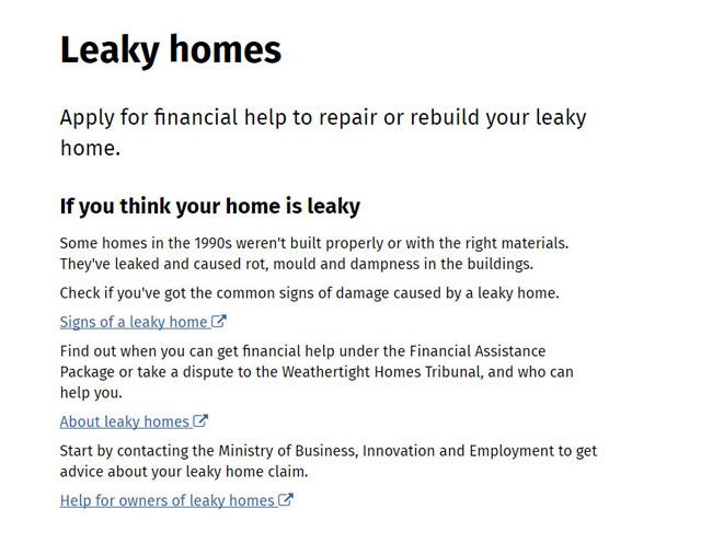
An example of a page about leaky homes with 'signpost' content.
New content needs new templates
It was clear that the existing architecture of the site wasn’t going to hold the amount of content we were about to produce. For example, the number of pages in the health hub tripled, and we’ve gone from having one page on marriage to 11. Over the last six months, we added an extra level to the site’s structure so that the content had room to grow, and created new templates and adjusted existing ones so that the site remains easy to navigate.
Content-led design template
Designing templates requires having one eye on the big picture, and the other firmly on the details of the content being worked with. We make a point of designing with real content, because there’s nothing like real data to break something you think will be foolproof. It was also helpful to see the natural shape of the content before it was crammed into a template. At the same time, it was important to be thinking about how the templates might work not just for a particular topic, but on hundreds of other pages — most of them not written yet!
To manage this, content editors and designers worked side by side. As the content was drafted, we fitted it into prototype templates, tested it and refined the templates at the same time as we refined the content. Developing the content this way, it wasn’t always easy to devote attention to both the big picture and the detail of writing simultaneously. However, the outcome is templates that fit the content, and we’ve smoothed the road for everyone who’ll use them in the future.
They’re not finished either — we’ll be watching how these templates perform over the next few months and we’re sure there’ll be some tweaks.
Process page template
The first template off the rank was the process page, which describes a process using numbered steps. During the discovery phase for information about services for older people, we found that most of the information needed was about government services. This is because when it comes to interacting with government, and especially the health system, we found that many older people don't act until they have to and they aren't looking for general advice from government. We also found that structure and consistency is especially important for people with cognitive impairments (which are more common in older people), so it helps if they are stepped through information in a structured way.
I like things to happen in a sequence. When you go back, you forget where you were.
A process page can be used for any series of sequential information, but we've set up headings which guide people through the service we’re describing. These are structured in order of importance so people know first what the service is, who can get it, how to apply and what happens next. We used headings instead of a hard-coded template so that there’s flexibility while we road test these with lots of content. However, even though they’re not set in stone, we are moving towards more structured content. Eventually this structure will mean we can recombine chunks of content in new ways.
We also saw some older users struggle with scrolling either because they were new to using computers, or because their motor control was limited. For this reason, we designed the process page to show steps one at a time, so that pages are short and manageable. This also helps users with low literacy since scrolling requires users to scan the page to pick up where they left off, and this is difficult if reading is hard.
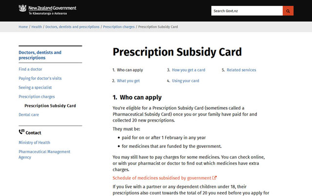
The new process page template in use for the Prescription Subsidy Card.
Timeline template
When looking at bigger processes that have several distinct steps, like getting married or having a baby, we found that users needed to see the big picture before diving into the detail. They needed to know they weren’t missing anything important. For this purpose, we developed a timeline template. It gives a brief overview of an end-to-end process, and links people off at each step to more detailed content.
It has tested well with users. People use it to navigate, skimming over it to start with, exploring, and then returning to it for the next step.
A step-by-step guide to getting married, that’s great.
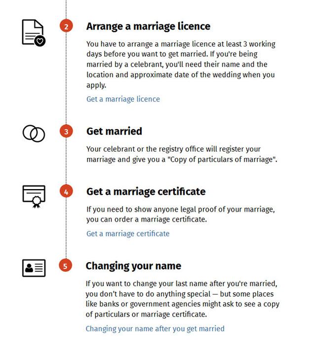
Detail from the How to get married in NZ timeline.
Edge case accordions
Because government processes often evolve quirkily over time, we’ve found that sometimes a process which is actually simple for most people can be very confusing because of the number of small but specific exceptions to that policy. Sometimes the amount of content describing edge cases is double that of the content that applies to everyone, but people will read it out of fear they’ll miss something.
We want to streamline content for the majority, while making sure information that is important to smaller groups is still available. To do this, we use accordions for these edge cases. These have a descriptive title, then additional information is tucked inside a disclosure widget (accordion).

A screenshot showing ‘edge cases’ - or information that is only relevant to a subset of users, on the Get a birth certificate page.
Hub pages
Our hub pages are the general intermediate navigation pages that take people from the home page to detailed pages. With lots more topics being added, they were starting to get very long very quickly. So, we reintroduced sub-hubs, a way to cluster pages into smaller groups under a hub.
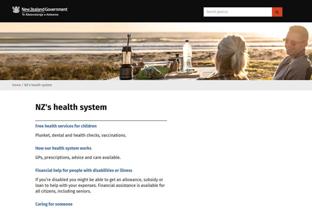
The previous design for the health hub.
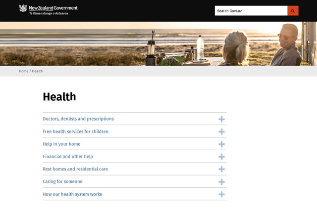
The updated design of the health hub page.
We also wanted a way to help people get to the right page. Instead of making people click onto a sub-hub page to see if the information they needed was there, users can expand a sub-hub menu from the hub page, so they can compare several topics if they’re not sure.
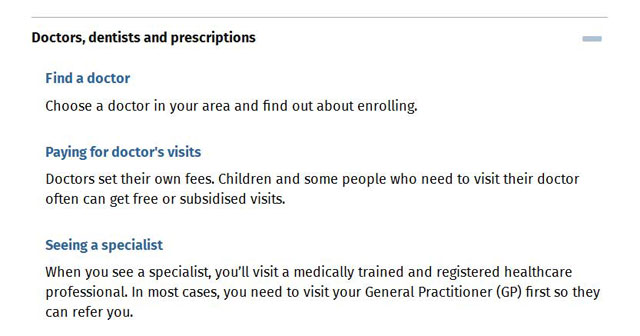
Detail showing expanded menu on a hub page.
The other benefit of this design is that it makes hub pages much shorter, again reducing the need to scroll and helping a range of users.
Usability testing
We tested these changes through a medley of methods. We did some guerilla testing with draft content and prototypes at the Taita Library and Smart Newtown computing hub, as well as at the National Library of New Zealand. We made these prototypes by hacking some pages together on one of our test servers. We used existing page types creatively and inserted images of what the new layout would look like. Making cheap prototypes like this meant we could A/B test different versions. For example, we tested putting the process page with all the steps on one page in an accordion, versus split into a page per step. We found that once people had expanded all the sections, the single page became difficult to navigate, as it got very long. People were also slightly more likely to read the steps in order when they were page by page.
To see where people would click first on screenshots, we ran ChalkMark click tests on both desktop and mobile. The tasks we set here meant users had to go up a level, down a level or sideways through the content. We had 35 people complete the desktop test, sourced by sending out a request through our @GovtNZ Twitter account and one of the Department of Internal Affairs contact centres, and got our team to do the mobile test.
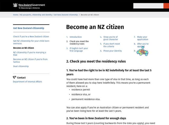
Where would you click if you wanted to find out more about the ceremony? This screenshot of the ChalkMark results shows a heatmap of where users clicked on the Become a citizen page (the text under the clicks reads ‘citizenship ceremonies’).
Finally, we ran longer in-person usability tests with seven participants to check that the pages were working with finalised content.
We’ve also set up our analytics tracking, so we’ll keep watching the data over the next few months as people begin to use the new templates. We’ll make adjustments as we keep learning about how they’re used.
Our testing ranged from ‘quick and dirty’ to professional recruitment for hour long sessions, and we got a different insights from each test. This user testing put into practice our principles of ‘test small and often’ and ‘test the test’. We got information along the way and fed it back into the designs before validating that it worked for people at the end.
Watch out for other posts coming up soon about the information for older people pilot.


